Summary: Eyetracking visualizations show that users often read Web pages in an F-shaped pattern: two horizontal stripes followed by a vertical stripe.
F for fast. That’s how users read your precious content. In a few seconds, their eyes move at amazing speeds across your websites words in a pattern that’s very different from what you learned in school.
In our new eyetracking study, we recorded how 232 users looked at thousands of Web pages. We found that users’ main reading behavior was fairly consistent across many different sites and tasks. This dominant reading pattern looks somewhat like an F and has the following three components:
- Users first read in a horizontal movement, usually across the upper part of the content area. This initial element forms the F’s top bar.
- Next, users move down the page a bit and then read across in a second horizontal movement that typically covers a shorter area than the previous movement. This additional element forms the F’s lower bar.
- Finally, users scan the content’s left side in a vertical movement. Sometimes this is a fairly slow and systematic scan that appears as a solid stripe on an eyetracking heatmap. Other times users move faster, creating a spottier heatmap. This last element forms the F’s stem.
Obviously, users’ scan patterns are not always comprised of exactly three parts. Sometimes users will read across a third part of the content, making the pattern look more like an E than an F. Other times they’ll only read across once, making the pattern look like an inverted L (with the crossbar at the top). Generally, however, reading patterns roughly resemble an F, though the distance between the top and lower bar varies.
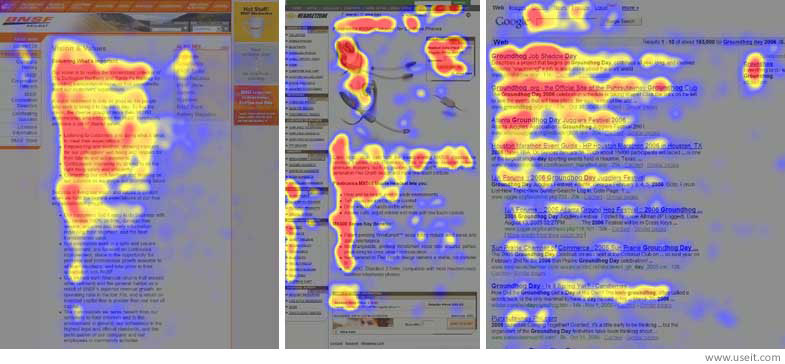
Heatmaps from user eyetracking studies of three websites. The areas where users looked the most are colored red; the yellow areas indicate fewer views, followed by the least-viewed blue areas. Gray areas didn’t attract any fixations.
The above heatmaps show how users read three different types of Web pages:
- an article in the “about us” section of a corporate website (far left),
- a product page on an e-commerce site (center), and
- a search engine results page (SERP; far right).
If you squint and focus on the red (most-viewed) areas, all three heatmaps show the expected F pattern. Of course, there are some differences. The F viewing pattern is a rough, general shape rather than a uniform, pixel-perfect behavior.
On the e-commerce page (middle example), the second crossbar of the F is lower than usual because of the intervening product image. Users also allocated significant fixation time to a box in the upper right part of the page where the price and “add to cart” button are found.
On the SERP (right example), the second crossbar of the F is longer than the top crossbar, mainly because the second headline is longer than the first. In this case, both headlines proved equally interesting to users, though users typically read less of the second area they view on a page.
Implications of the F Pattern
The F pattern’s implications for Web design are clear and show the importance of following the guidelines for writing for the Web instead of repurposing print content:
- Users won’t read your text thoroughly in a word-by-word manner. Exhaustive reading is rare, especially when prospective customers are conducting their initial research to compile a shortlist of vendors. Yes, some people will read more, but most won’t.
- The first two paragraphs must state the most important information. There’s some hope that users will actually read this material, though they’ll probably read more of the first paragraph than the second.
- Start subheads, paragraphs, and bullet points with information-carrying words that users will notice when scanning down the left side of your content in the final stem of their F-behavior. They’ll read the third word on a line much less often than the first two words.
Detailed Scanning Behaviors
It’s fascinating to watch the slow-motion replay of users’ eye movements as they read and scan across a page. Every page has reading issues beyond the dominant F pattern I’m discussing here. For example, users scan in a different, more directed way when they’re looking for prices or other numbers, and an interesting hot-potato behavior determines how users look at a list of search engine ads. We also have many findings on how people look at website images.
The biggest determinant for content usability is how users read online — and because people read differently, you have to write differently.